Submarine Channel

Next 5 Storyboards
Top5's
Next 5 Storyboards
In the American animation studios, story artists like to play story games. Often done as warm-up exercises, story games such as Next 5 are also a popular assignment during story internships. These games are a lot of fun to do, but they are also a great way to practice some of the basic skills of visual storytelling.
One of the most popular story games is the Next 5. To play this game you need a photo, or an illustration, or even a word (more on that later). You then use this photo to come up with the next five shots of the story. The idea is to take a random photo and treat it as the first panel of a story. You have to come up with the next five panels – each one picturing a unique, individual shot. Together these six should convey a complete idea. Dialogue is sometimes added, but ideally the goal is to use only images to tell your story.
If you’re a student interested in story, or you just want to put some storyboards in your portfolio, this game is a great way to get started! It is fast and fun and it will give a pretty good indication of your story skills. It shows what kind of crazy stuff you can come up with on the fly. It’s also a great exercise in clarity; one of the most important things in storyboarding. And because of the limitation of panels, you need to be very economic in the way you tell your story.
Here is my top 5 of Next 5 stories done by professional board artists.
1. Emma Coats
You might know Emma Coats from her 22 story basics. This series of tweets about the things she learned while working as a story artist at Pixar went viral a few years ago.
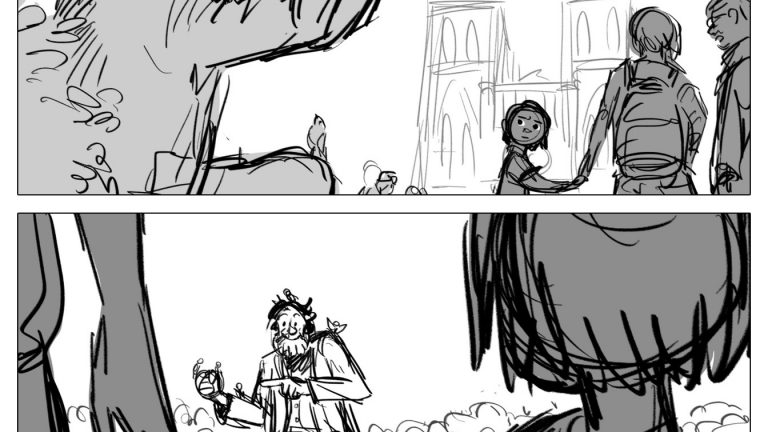
For this Next 5 storyboard, Emma started with this Flickr photo. I like how she cuts from the (given) close opening shot to a wide establishing shot. She shows us how this scene is laid out before going close to introduce the characters. This little sequence is also a good example of maintaining screen side. Note how the bird man is always on the left side of the frame, while the girl is kept on the right.
Emma’s tumblr (which unfortunately hasn’t been updated in two years) is a fantastic place to gather story wisdom. When somebody asked her where she got the inspiration to come up with this particular storyboard Emma explained that she starts by asking herself, ‘What wouldn’t happen next’. She looks at the situation shown in the photo and wonders what would never happen here. Then she asks herself, ‘but if it did happen, why would it? (…) You have a situation and something interesting + contradictory; the story is in how you justify what’s going on. How you explain it.”
2. Mike Yates
Many storyboard artists are already in their late 30’s by the time they start working at one of the major studios. Michael Yates on the other hand is still a young guy, but he has already worked (or interned) at Moonbot Studios, Walt Disney Feature Animation and DreamWorks. These days he is working as a story artist at Pixar.
As a student at Ringling, Michael used to post a lot on his Blogger. He still updates his Tumblr every once in a while. Browsing through these blogs you can see how he always keeps working on his story skills, and you’ll see he used to do a lot of these exercises. Back when I was in school I loved browsing blogs by professionals I admired. I still do. It is so cool to see their growth. And it’s comforting to discover that they didn’t start out as the art superstars they are today.
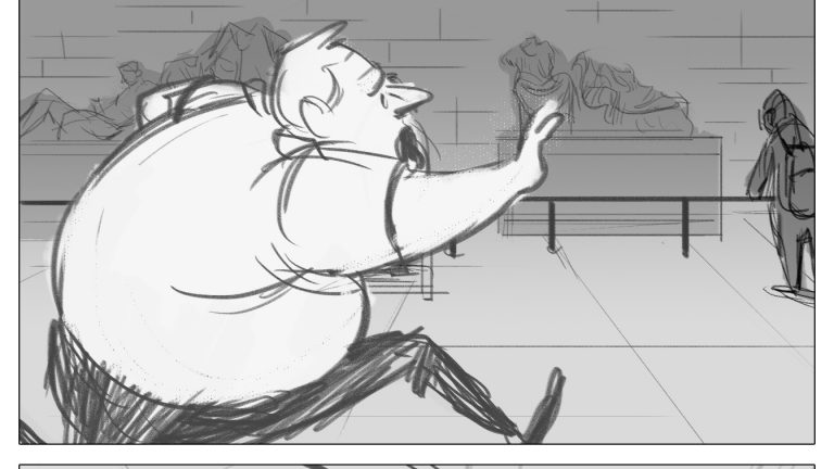
Michael did this Next 5 back in 2011. It was based on this picture. As you can see Michael is deviating from the original exercise a little. The first three images are actually one single shot. There are only five images instead of six. But that’s okay. The objective of games like this is not to be dogmatic about it. It should be a fun way to jumpstart your imagination while at the same time improving your skills. If you have a great idea that’s just a little different, go for it!
3. Lissa Treiman
This is probably my all-time favorite Next 5. And, by the way, I also love seeing these different Next 5’s together. I don’t know about you guys, but I can immediately feel what kind of film all these sequences are from. Lissa Treiman’s Next 5 is of course from a super romantic Western drama.
Lissa Treiman works at Disney Feature Animation and is also known for drawing the comic Giant Days. She occasionally updates her Tumblr and she shares her art on Twitter.
The board was inspired by this photo. As you can see to make the photo fit a film-sized frame, Lissa had to adjust the aspect ratio. Just like Michael she ‘cheats’ a little, she has added a panel to show the horse’s foot entering the frame in the first shot, making this more of a Next 6, I guess.
Lissa gave some insight into how she likes to start with these exercises for another Next 5 she posted on her Tumblr. While looking at the photo she wonders what question the photo poses, that she’s going to answer in her boards. “Where are we? What/who are we looking at? What/who is looking at it (the answer to this can be ‘the audience’)? WHY are they looking at it? etc.”
Lissa also mentions how she renders her Next 5’s in more detail than her storyboard assignments, adding, “In storyboarding the important thing is to draw quickly and clearly. I chose to get fancy :)”
4. John Nevarez
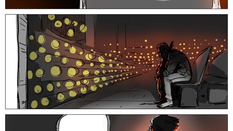
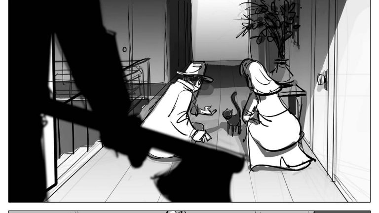
Some time ago John Nevarez shared his take on the Next 5 on his Facebook. He started with a vintage pulp illustration as his source of inspiration and drew the next six panels (instead of five).
John Nevarez drew three different boards instead of just one. This being the third and final take. The great thing about this is that it pushes you to go beyond your initial idea, which tend to be a bit more obvious.
John has worked both in story and as a vis-dev artist at most of the major studios. These days he is working at Sony. John is a fantastic draftsman, but you can tell that he didn’t care to much about drawing pretty when he was doing this. Not that this board doesn’t look good, I think it looks spectacular. But you can tell he was working fast. Just look at the raw energy in that sketch of the cat attacking the axe murderer!
The final two panels of this board are a perfect example of how rough and messy a board can be, while still clearly communicating what’s going on in the story. If you have time you can go over your rough drawings and clean ‘em up, but you don’t need to. All you need to convey the idea is here.
5. Austin Madison
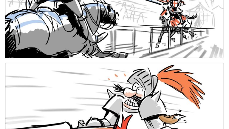
Why use six or even seven panels to tell a story, if you can do it in just four? About five years ago Austin Madison would post these four-panel story challenges on his blog. The challenge was to do a mini sequence of only four panels based on a word or phrase. The challenge for this one was ‘Tournament Squirrel’.
This little storyboard is a perfect example of compiling information. If you work with such a limited amount of panels, you’ll need to show more than one thing in each frame. In the first panel we see the squire putting the squirrel in a boot. We are also introduced to the knight with the red cross, who is preparing for a tournament. And in the last panel we see the squire getting paid by the opponent, as the first knight is being carried away on a stretcher.
If you would board this out in detail these moments wouldn’t happen simultaneously. But by putting them in the same shot, you’re being more economic than when you’d have to cut to a separate shot with the second action.
Austin Madison has worked both as an animator and as a story artist at Pixar. (He’s still there. If someone knows at which department he’s currently working, we’d love to know!). He regularly posts art and tips on his Tumblr.
If this article inspires you to do one of these please do leave your link on Twitter or Facebook. We’d love to see what you come up with!
Joscha van Deijk is an Amsterdam based storyboard artist. He loves Film-Noir, Batman, Tintin, Rembrandt, the Beatles and more. You can find him on Twitter and Tumblr.
